Luxury brands have traditionally been a bit slower to take
up new technologies, therefore it is interesting to watch when and at what pace
they play catch up. Recently some brands have rolled out more frequent website
updates to drive traffic from both a search perspective, and visual and UX standpoint.
Aston Martin chose to announce the redesign of their site via the brand’s
social media outlets, instead of simply releasing the changes through an
announcement on the site page itself, noting on Twitter both the “new and
improved homepage design and navigation.” This was an interesting tactic for
Aston Martin because it helps drive current brand enthusiasts to the new site,
in effect to test out changes, tracking time spent on the site and identifying
the most popular areas or content. Instead of having to navigate to a
particular model, the different cars are the first menu options at the top bar, and
slide across as full-screen images on the home page. As most users are likely
looking for a particular car within the Aston Martin line, it was
advantageous for the company to retool the site to align more closely with
those search inquiries and page visits.
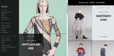
Marc Jacobs also recently revamped its online flagship,
taking away some of the hierarchy to streamline the process of viewing and
purchasing the product. The side menu is now organized in the same way in which
customers would shop in-person, structured by gender, rather than by collection.
Once navigating to the women’s section, the grid layout carries over from the
home page, but there is also a split screen with two scroll bars. This could
prove somewhat confusing or overwhelming, but does allow the site to push a ton
of content and descriptors onto one page, which may help drive traffic from a
search perspective.
Providing frequent website updates can help a brand stay
relevant, not only through its content but also by staying up to date with
developments in web design and architecture. Incremental changes make it easier
to stay on the forefront of a competitive market that demands unique online
experiences, meaningful content, and ease of use – and that’s just once the
customer is already on the site. Driving customers to the online flagship
requires proper understanding of the back end design as well, which Aston
Martin and Marc Jacobs appear to recognize and work towards.


